The old phrase goes, “You should never judge a book by its cover,” but when it comes to shopping online, customers ARE going to judge your product based on its appearance. When customers visit your eCommerce site, make sure you display your products in the best possible light (pun intended) to delight your viewers, not repel them.
You want customers to trust your product, and how you portray your products on your eCommerce site directly influences whether or not they’ll buy from you.
One of the secrets to our success with eCommerce product photography is remembering some key factors that go into the specific photographs being taken. Here are 3 tips and tricks to help develop a product photography strategy that converts:
1) STICK WITH A CLEAN, CONSISTENT BACKGROUND
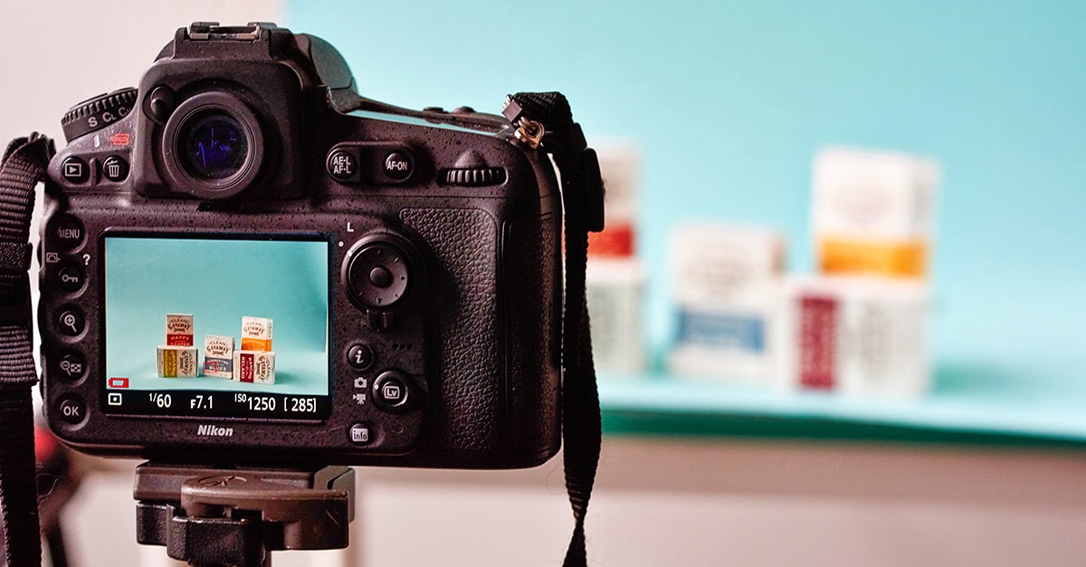
At Groove, we’re big fans of using Ortery equipment for small to medium-sized products that need to be photographed.
No matter what technology you use, we recommend using a clean, solid white wall or background. White is a classic background color for shooting product photography, but be aware of how it will contrast with the product and how it will display on your website.
If your product or your website color palette is predominately white, use a darker or textured background, or monochromatic fabric to add some contrast and make the product really come to life instead of blend into the background.

If you’re shooting the same products in different colors, flavors, etc., make sure there is a consistency in how the images are shot. This means making sure products are against the same background, at an equal distance away from the camera and filling the same position and space within the frame. A uniform series of images gives an aesthetically pleasing appearance and adds a level of professionalism across your eCommerce site.
2) DON’T FORGET THE DETAILS
When customers shop around your site, they try to gather as much information about your products as possible. Since most online shopping limits your visitors to one of the five senses — sight — you have to make sure they can clearly see every aspect of your product.
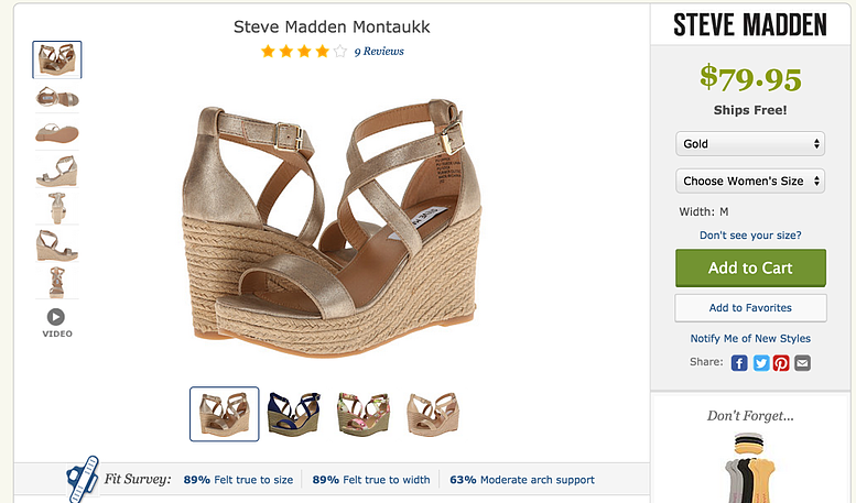
Utilize a series of angles when it comes to taking pictures of your products — especially when it comes to products in the fashion industry. Think about how you look at shoes when you’re shopping online: You want to see the designs in detail, how the shoes look from all angles and the variety of colors.
Create a virtual experience for the user to explore all the options you have to offer by taking 360° imagery (an awesome feature of the Ortery Photosimile 200). 360° images allow the user to explore your product from various angles and help answer any questions they may have that couldn’t be answered if they were faced with only a single, static shot of your product.
Zappos does a great job of showing a wide variety of high-quality, dynamic shots of their shoes in the color options they offer, and they even allow the customer to zoom in to see the details of the design.

3) SHOW THE PRODUCT IN USE AND GET CREATIVE WITH IT!
Does your product have any key features that set it apart from your competitors’ products? If your handbags are known for their adjustable straps and that’s something featured in the product description, show it off by taking a few lifestyle shots of your product in use!
A key skill in taking photography of any kind is being able to properly work with and manipulate the space around your subject matter, so get inside the mind of the user and get creative with it!
It can be a bit of a dance and a definite learning curve, but once you learn to embrace the space instead of fear it, you’ll find that it’s much easier to work with.
If you’re working with multiple items in your photo, don’t just lay them out in a straight line and expect your customers to swoon. It’s about positioning, choice of colors to include and disregard, and what you want your audience to focus on when they look at the photo.

The next time you’re getting ready to shoot your products, ask yourself these questions:
- What’s the most visually engaging piece of product in this photo?
- What will get lost in the background if I don’t make it pronounced?
- Am I highlighting the product’s benefits in the best way possible?
Through all of Groove’s photography endeavors, we’ve learned that you can take almost any product — from the blandly mundane to the flamboyantly dynamic — and make it visually alluring through quality eCommerce product photography.
In regards to your eCommerce website, it’s about creating content that is so engaging that every person who sees it will want to click on it to know more and ultimately purchase your product.

